

Posters
- “Where messy minds come to unwind” — the positioning line as a hero poster, paired with a doodle figure.
- “Chaos · Mess · Clarity” — a three-poster set, each carrying its matching stage of the doodle sequence.
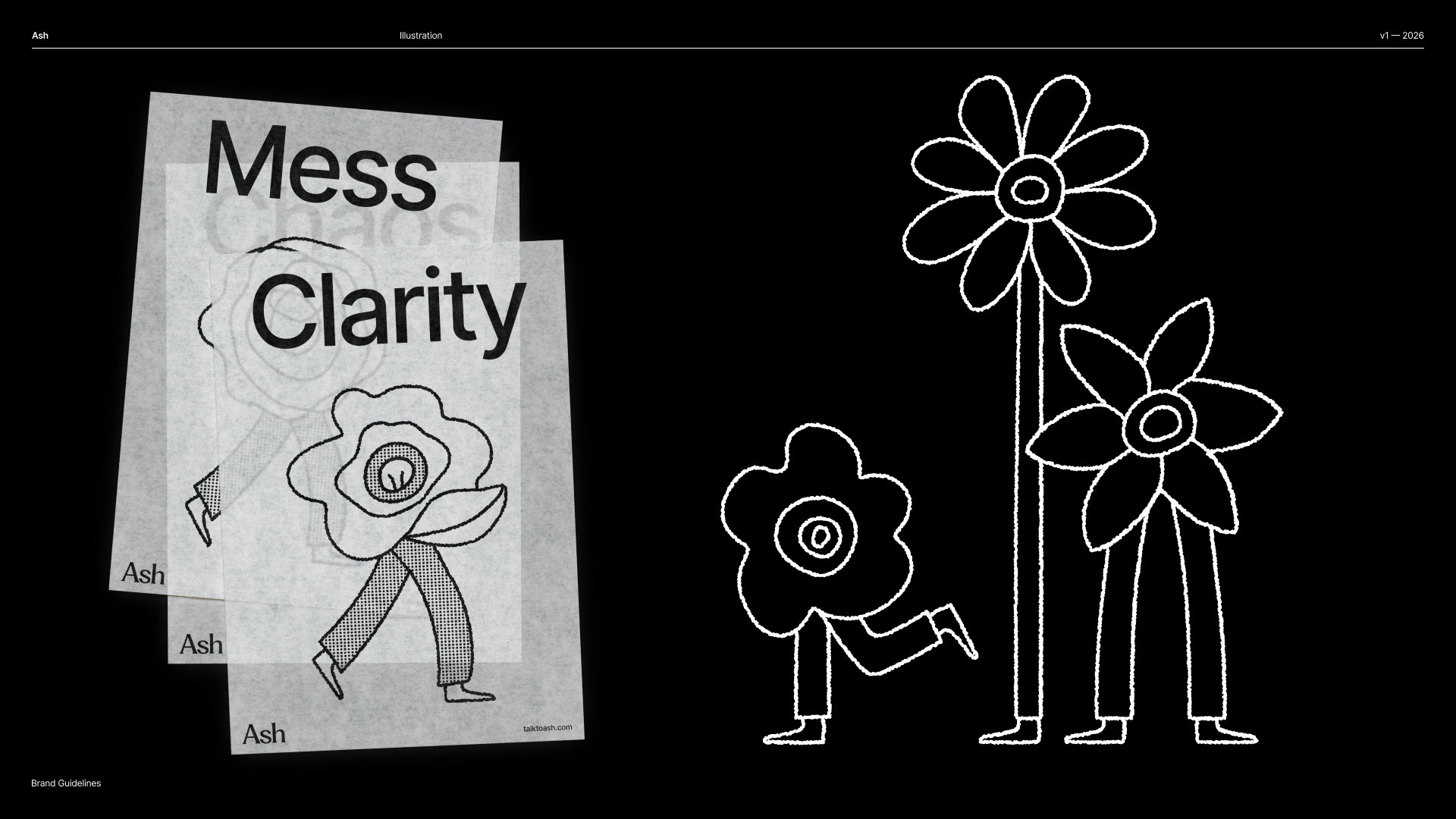
The Chaos · Mess · Clarity poster set, stacked — each stage carries its matching doodle figure.
Merch
- Tote bags carrying the wordmark and doodles, white on black — the identity at its most confident and simple.
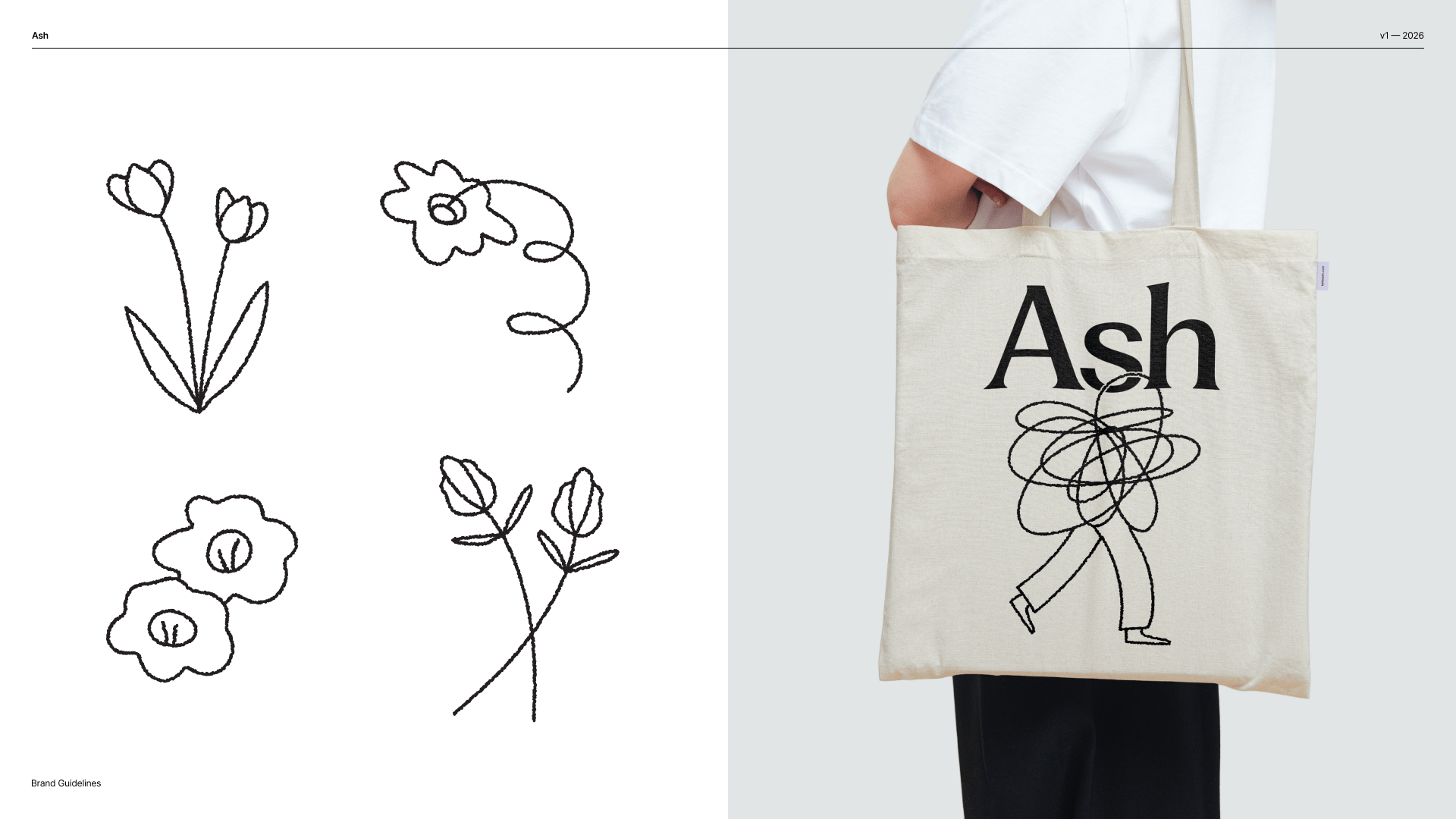
The kit in the world: sketch-sheet doodles beside the tote — wordmark plus one scribble-headed figure on natural canvas.
Invitations
- “Party! You’re invited to help us celebrate our new digs” — a save-the-date that shows the playful end of the tone range while staying unmistakably Ash.
Environments & components
The book also covers environments (spaces and signage) and reusable layout components for composing branded pieces. These share the same kit of parts — nothing new is invented per surface.The rule that ties it together
Every application is the same handful of parts recomposed — marks, type, color, illustration, voice. When you make something new: start from those parts, keep it high-contrast and spacious, and let a single doodle moment carry the warmth.The Brand Book also details Photography and Video / motion direction. Those slides are the canonical reference — see the Brand Book — and can be written up here as dedicated pages when needed.