

The doodle style
- One continuous hand-drawn line. Wobble and imperfection are features, not flaws.
- Monochrome line — usually black on a light ground, or white on dark.
- Subjects: flowers at every stage of tidiness, and small flower-headed figures who walk, carry, and celebrate.
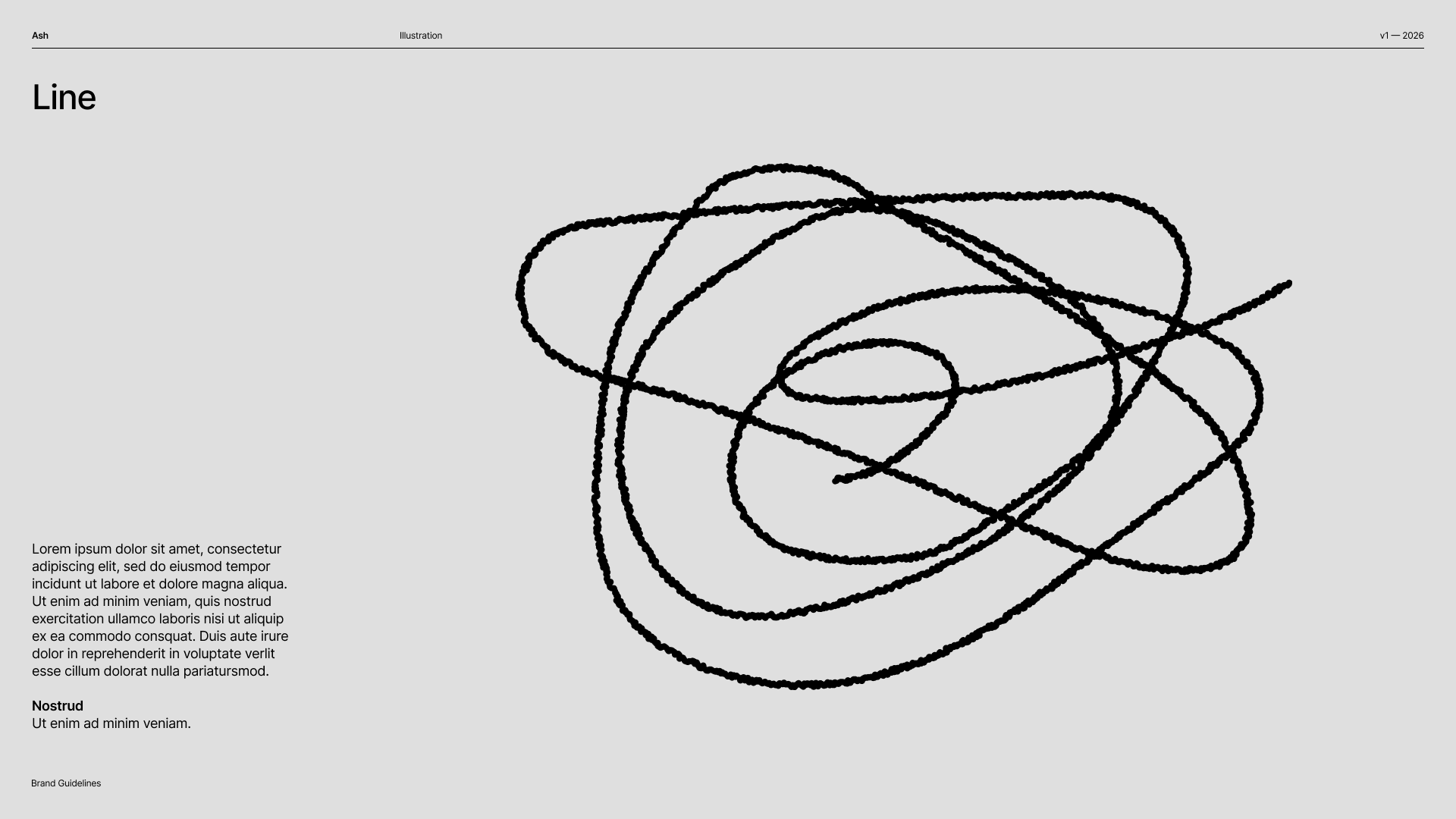
Line — one continuous, wobbly hand-drawn stroke. The imperfection is the point.
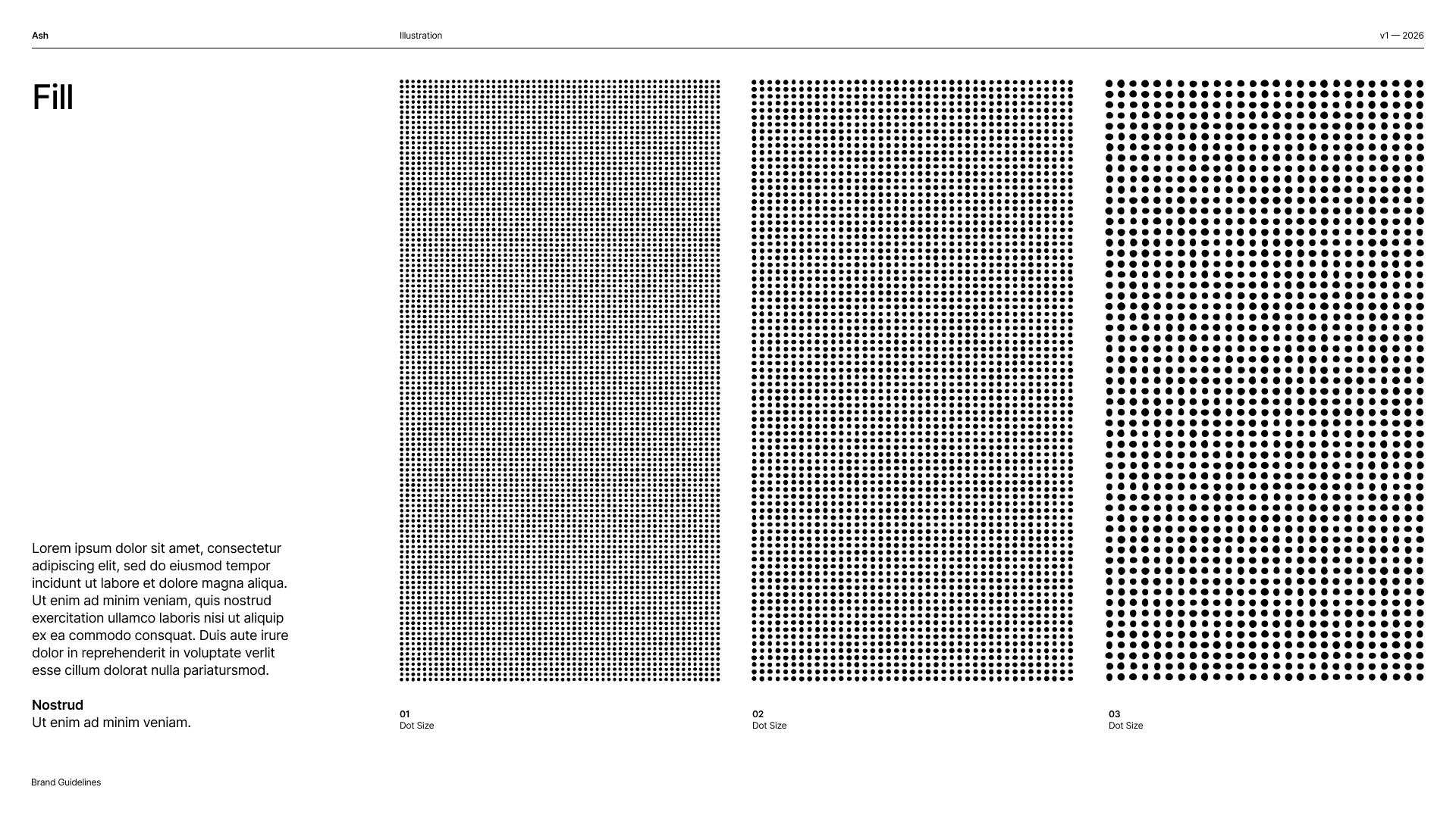
Fill — hand-dotted textures in three densities, used to shade the doodles without ever going slick.
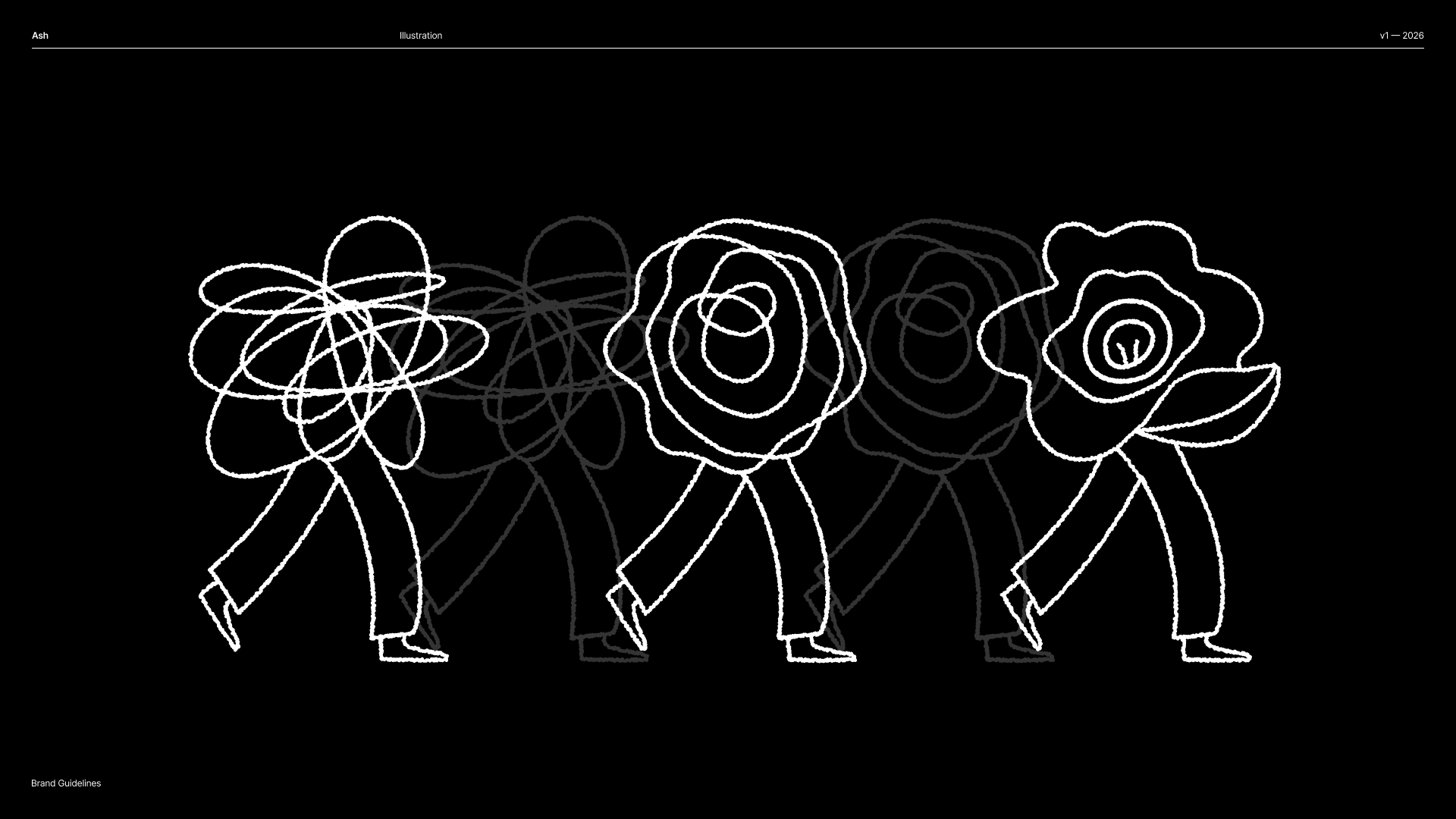
The same line works in reverse — white on black, where the brand is at its most confident.
Chaos → Mess → Clarity
The signature sequence is a dense scribble (chaos) that loosens into a rough bloom (mess) and resolves into a single open flower (clarity). It tells the whole Ash story in one glance, and it recurs across the brand — on posters, on merch, and as the arc of the product itself. See the brand story. Why flowers, why scribbles: a scribble is honest about the mess; a flower is hopeful about growth. Together they carry two of the three brand attributes at once.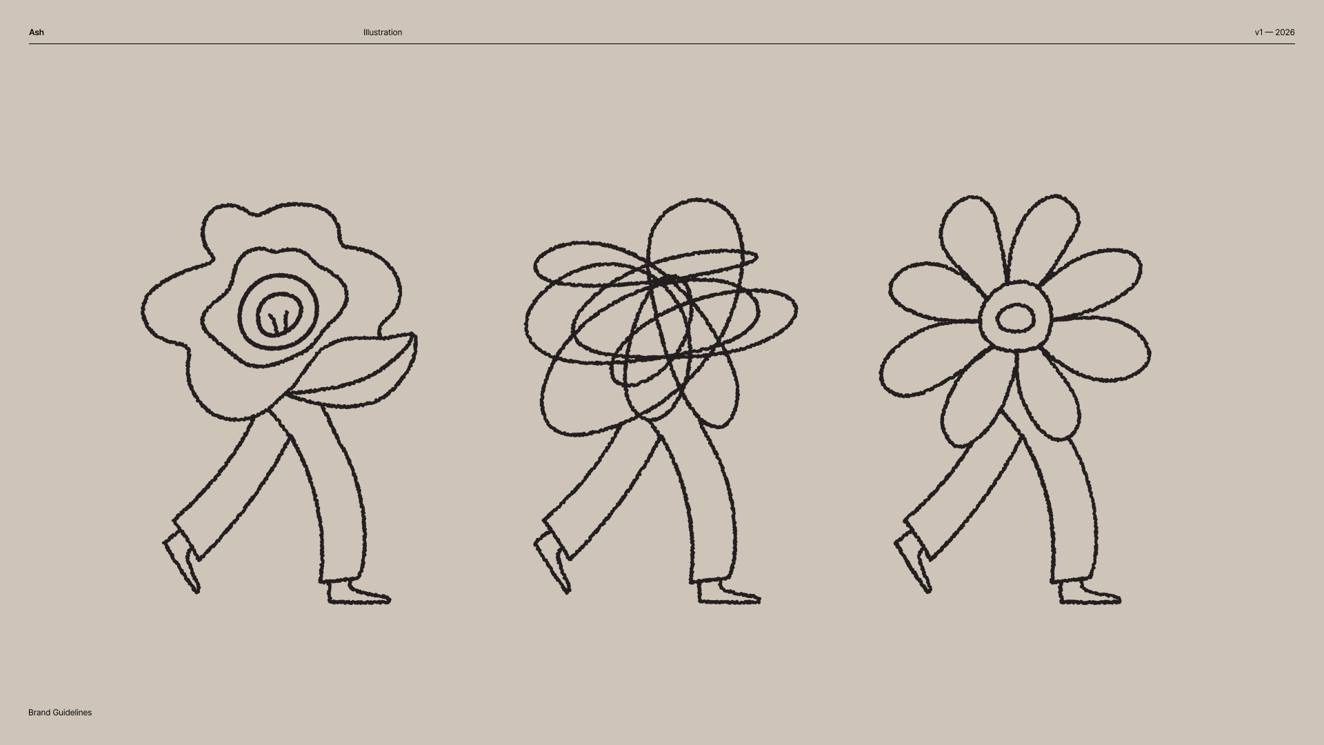
The three states as characters, mid-stride: a scribble-headed figure (chaos), a loosening bloom (mess), and a clear open flower (clarity).
In the app
The illustration language lives on in code as:- The Wallpaper system — flat brand colors behind cards and tiles, and soft gradient “blobs” behind hero surfaces. (The hand-drawn pattern imagery that once backed these surfaces was retired in July 2026; the hand shows up in the doodles below instead.)
- The flower and persona marks in
AshIcons(e.g.ashFlower). - The doodle components —
ConversationBubbleandLetterDoodleare drawn by the same hand.
Usage
Do keep it hand-drawn, monochrome, and personal. Use it to add warmth at meaningful moments.