

The palette, in short
- Core: black and white — with warm beiges standing in for grey. Ash deliberately avoids cold grey.
- Lead accent: Periwinkle — bold enough to be memorable, soft enough to be safe. It replaced the book’s Lavender Blue
#CDCCF0in October 2026. - Pastel accents: green, orange, and yellow — small moments of joy in illustration and applications.
Black
#000000White
#FFFFFFLight Beige
#F4F2EFDark Beige
#CEC5B8Periwinkle
#DBE1FDGreen
#9ED99DOrange
#F6CF98Yellow
#F5EAACSwatches are sampled directly from the v1 brand book’s chips; the book’s printed specs (CMYK / PMS) are still being filled in. For anything built in the product, the Sundial tokens remain the source of truth.
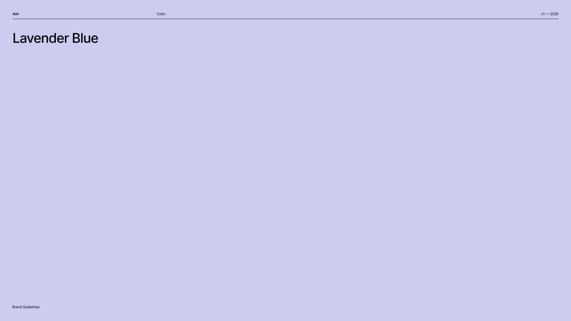
Lavender Blue — the book's original lead accent, since replaced by Periwinkle #DBE1FD.
How we got here
The 2026 palette is a correction, and the book is honest about it. The earlier identity leaned on heavy beige and a muted purple — warm, but murky, not punchy, and spread across too many colors to build recognition. What was missing: boldness, a signature tone with depth and appeal across genders, and a sense of joy. The answer was restraint — a black-and-white core with periwinkle in the lead.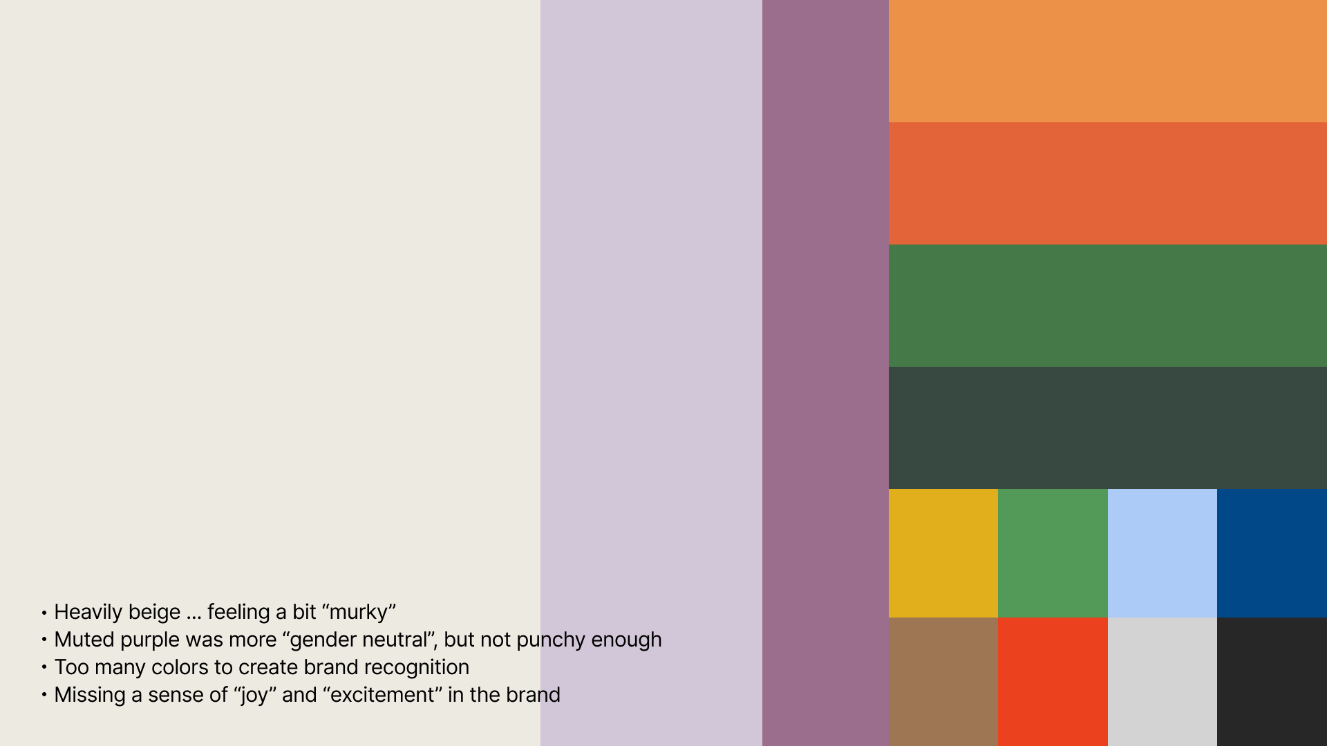
The book's retrospective: the old beige-and-muted-purple palette, annotated with why it fell short.
Where the real values live
Principles
- Warm over cold — parchment, not grey.
- Restraint by default — color earns its place; the canvas stays calm.
- Never rely on color alone to carry meaning — see Robustness & Readability.