

The wordmark
The wordmark is simply Ash, set in the brand’s warm classical serif (see Typography). It reads confident and book-like — more literary than techy, which is deliberate: Ash is a companion, not a gadget.- Default lockup is high-contrast and monochrome — white on black (as on the brand book cover) or black on a light surface.
- Mixed case — capital A, lowercase sh. Never all-caps, never restyled in another face.
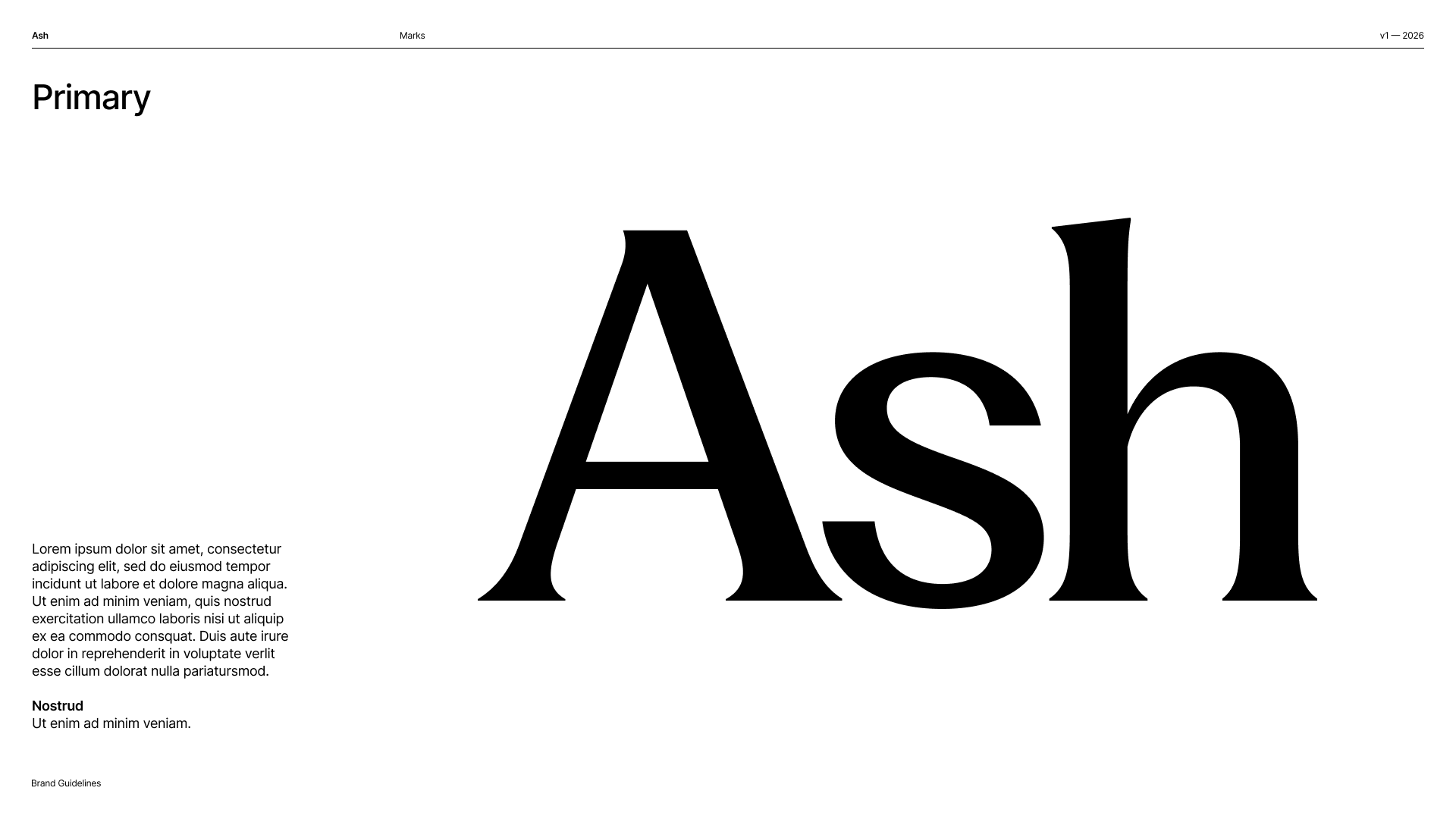
The primary mark, from the Brand Book's Marks chapter.
The badge
The circular badge places the wordmark inside a solid circle. Use it where a compact, iconic mark is needed — app icon, avatars, stamps, favicons — anywhere the full wordmark would be too wide.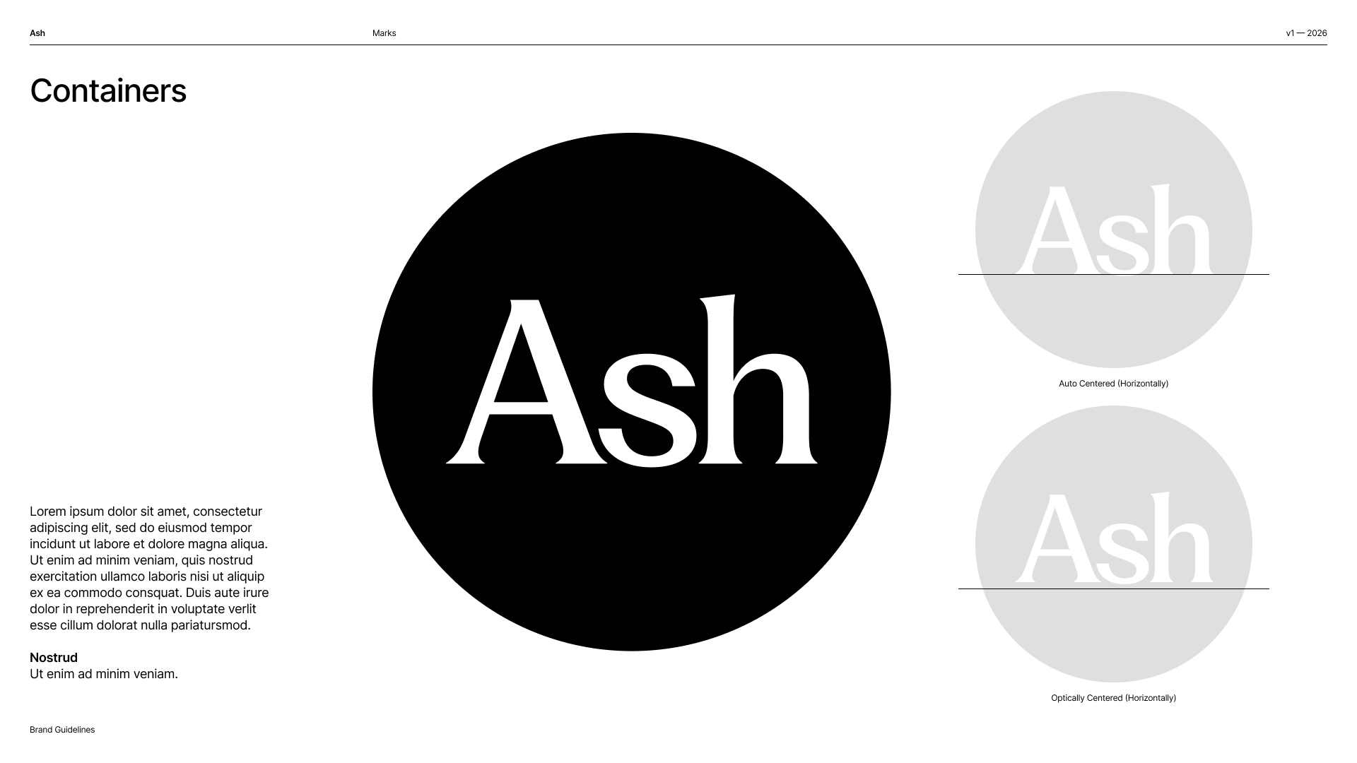
The circular badge. Note the book's rule: the wordmark is optically centered in its container, not auto-centered.
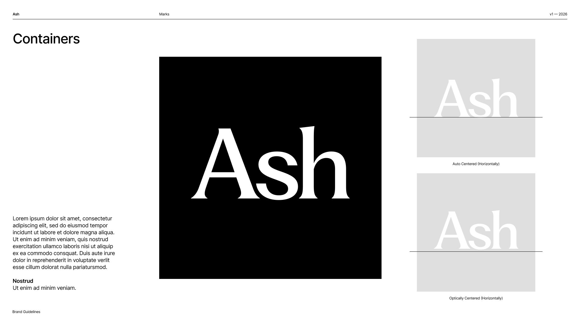
The same containment rules apply in square containers.
Clear space & size
Give the mark room to breathe. Reserve clear space of at least the wordmark’s own cap-height on every side, and never crowd it with other elements. Generous space is itself part of the brand — see Designing for Ash.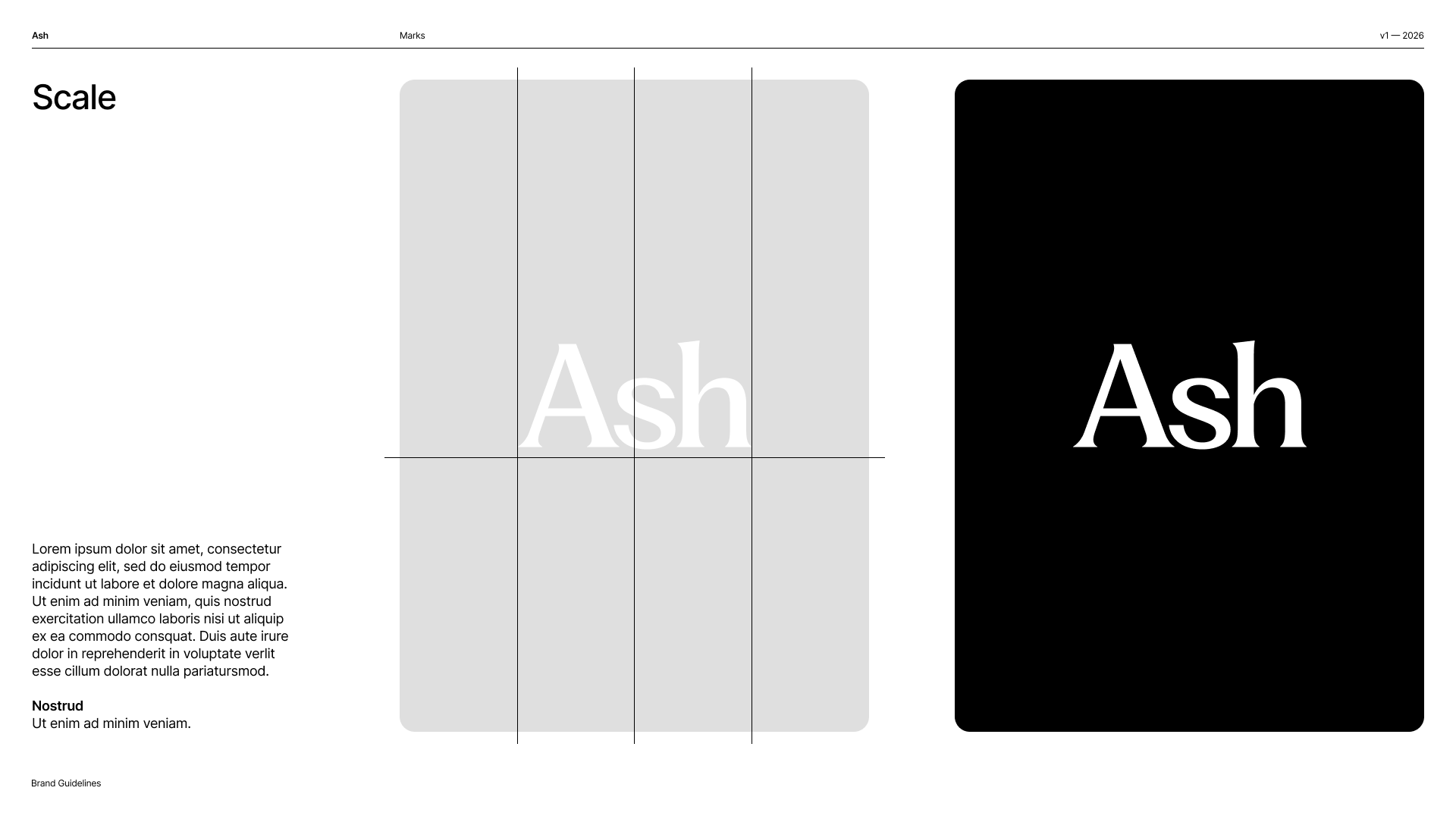
Scale guidance from the book — the wordmark sized against a poster grid, and at full bleed on black.
Usage
The marks travel with one accent: the hand-drawn doodle flower, in the same monochrome line as the wordmark’s ground.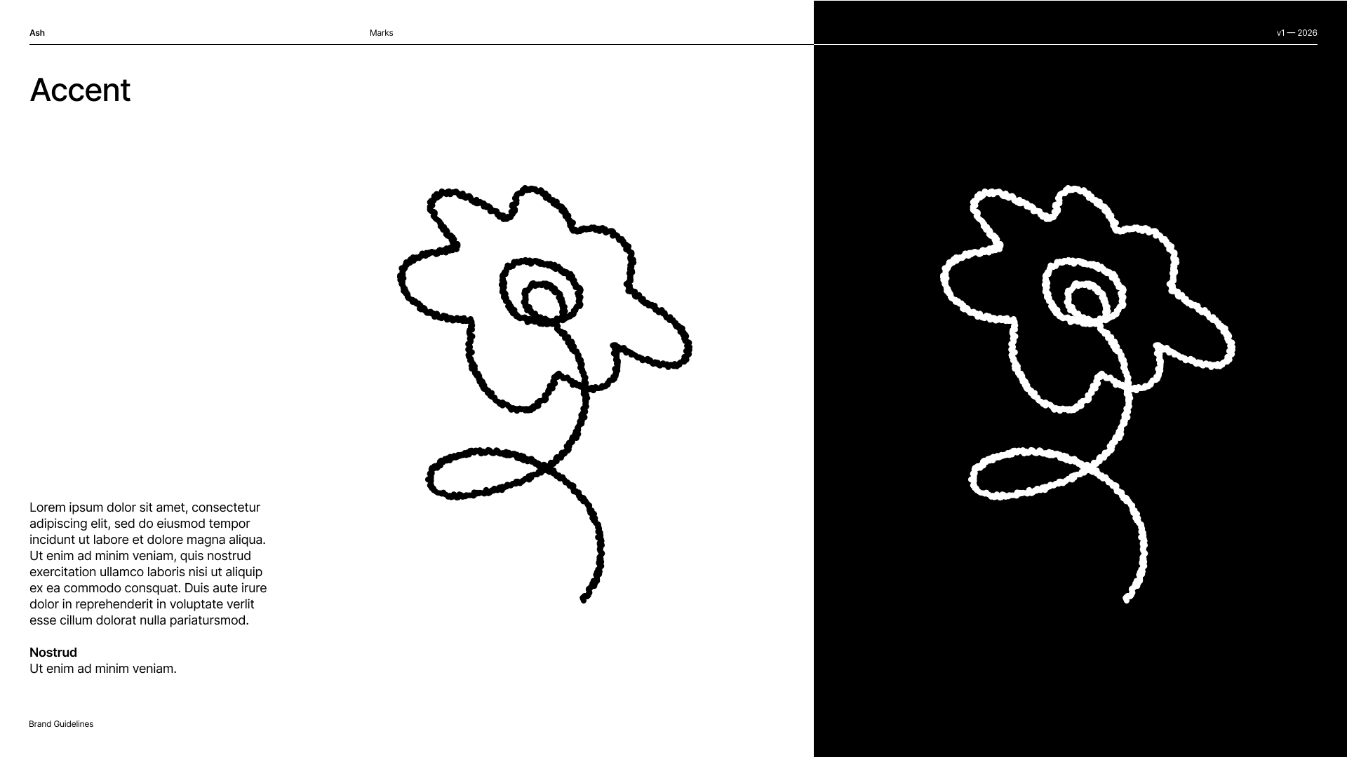
The doodle-flower accent that accompanies the marks — one hand-drawn line, black on light or white on dark.
In the app
The wordmark ships as theAshLogo component (width-driven, theme-tinted). The brand’s flower and persona marks live in the AshIcons set. The canonical mark artwork lives in the Brand Book.