

The pairing
- Serif (display) — the Ash wordmark and large emotional headlines. Warm, literary, book-like; it’s what makes Ash feel like a companion rather than a tool.
- Inter (working sans) — UI, body copy, labels, and buttons.
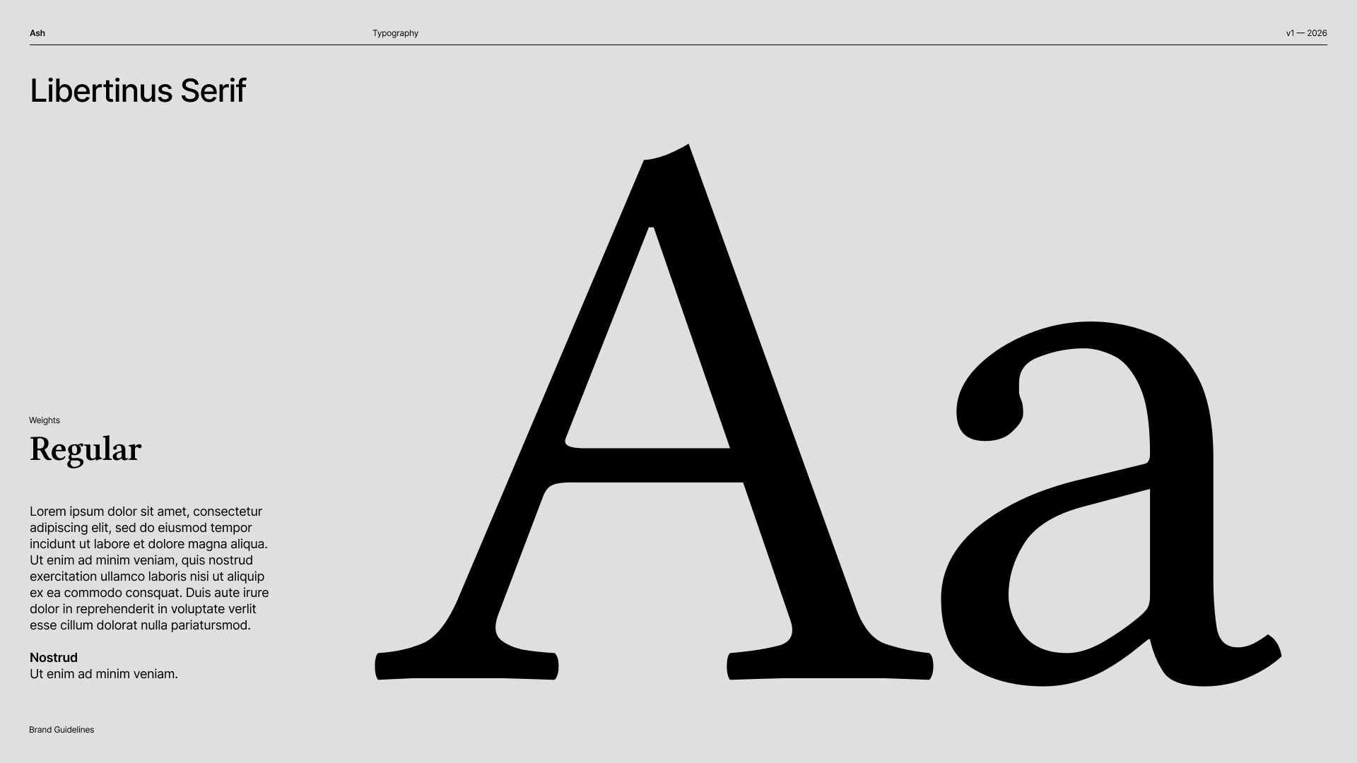
Libertinus Serif — the brand's voice. One weight: Regular.
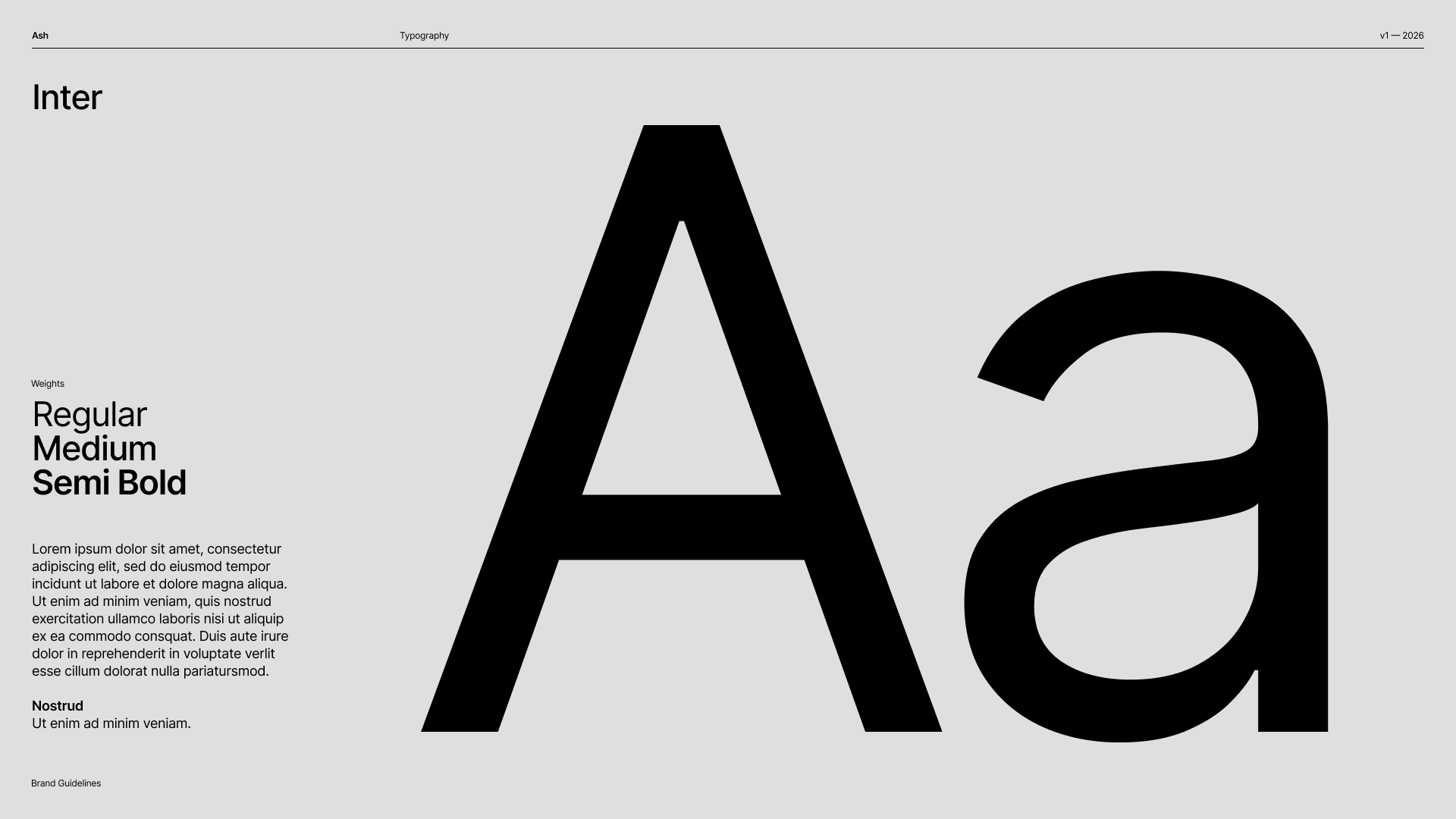
Inter — the workhorse, in Regular, Medium, and Semi Bold.
Principles
- Contrast through weight and color, not many sizes — see the typography craft rules.
- Use the serif sparingly, for moments that deserve a human voice. Don’t set UI chrome in it.
- Constrained scale only — choose from the system; never a hand-picked size.
The hierarchy in practice
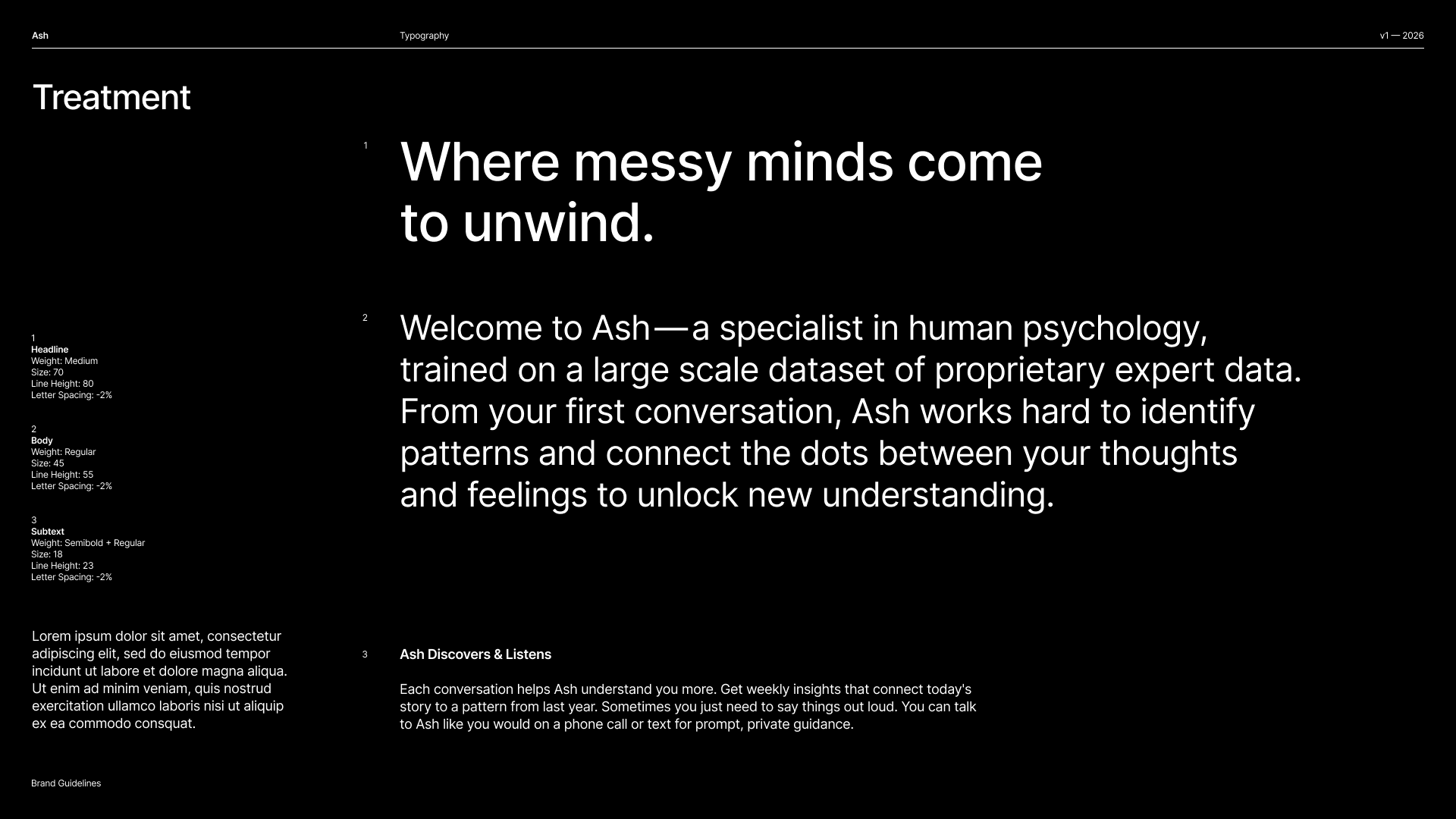
The book's treatment page: headline, body, and subtext working together in Inter — real product copy, not filler.