

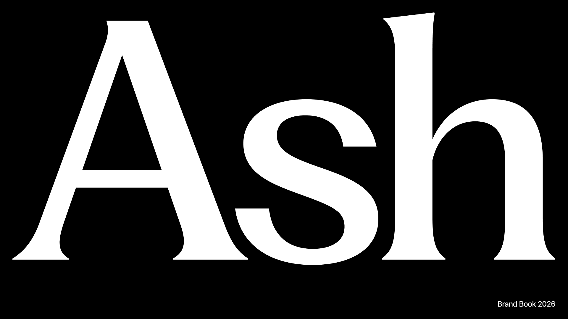
The cover of the Ash Brand Book — the wordmark at its most confident: white on black.
This section is drawn from the Ash Brand Book (the canonical source, in Figma). It captures the brand at the identity level. For the coded tokens and components that implement it, see the Design System; for the design thinking behind it, see Craft & Foundations.
Positioning
Where messy minds come to unwind.
Personality
Three attributes anchor every expression of the brand. When a design decision is in question, the answer is the one that is most warm, most trustworthy, and most hopeful.Warm
Made by someone who cares. Human, never clinical or cold.
Trustworthy
Calm, honest, dependable. Earns confidence quietly rather than demanding it.
Hopeful
Optimistic about growth. There is always a way forward.
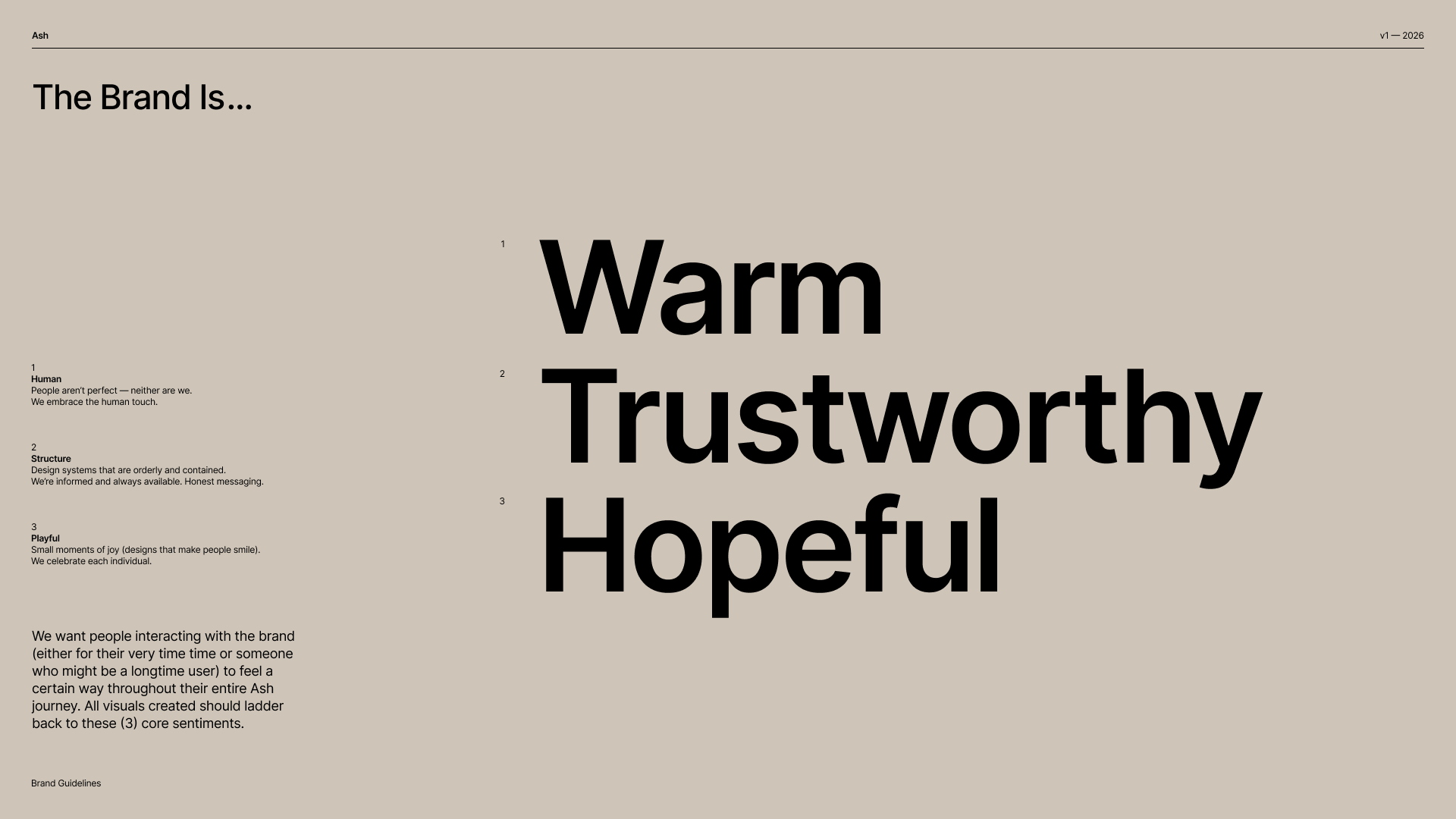
From the book: every visual should ladder back to these three sentiments — through what it calls Human (people aren't perfect, neither are we), Structure (orderly, informed, honest), and Playful (small moments of joy).
The story: Chaos → Mess → Clarity
The core visual narrative runs from a tangled scribble to a clear, open flower — three states that name the emotional arc of using Ash:Chaos
Tangled, knotted thoughts. A dense ball of scribble.
Mess
The knot begins to loosen and take shape — still imperfect, but moving.
Clarity
A single, clear, open flower. Not tidy perfection — just something you can finally see.
The brand book is modular
The Ash Brand Book is a modular system, not a fixed template — a kit of parts (marks, type, color, illustration, voice) meant to be composed for each context, from the app to a tote bag to a party invite. These pages document those parts.What’s in this section
Logo & Marks
The “Ash” wordmark and the circular badge — and how to use them.
Illustration
The hand-drawn doodle-flower system and the Chaos → Mess → Clarity motif.
Voice & Tone
How Ash speaks — warm, plain, and unhurried.
Color
The brand palette and how it relates to the Sundial tokens.
Typography
The serif voice and the working sans.
Applications
The brand in the world — posters, merch, and invitations.